Recent Work
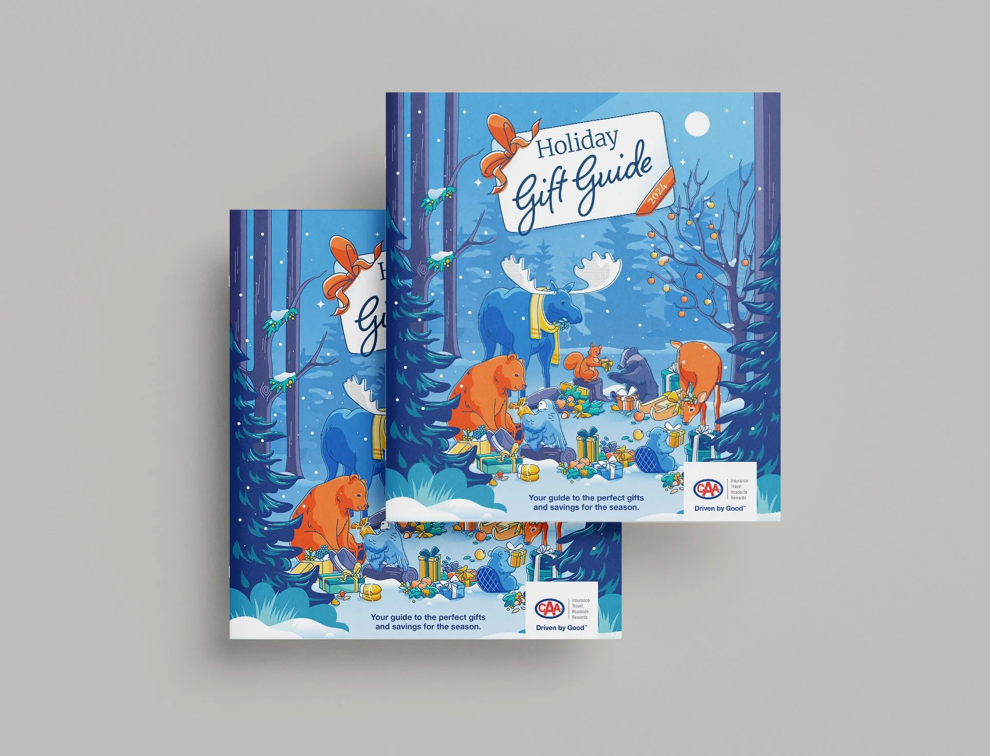
Holiday Gift Guide 2024
CAA Club Group
Business Challenge:
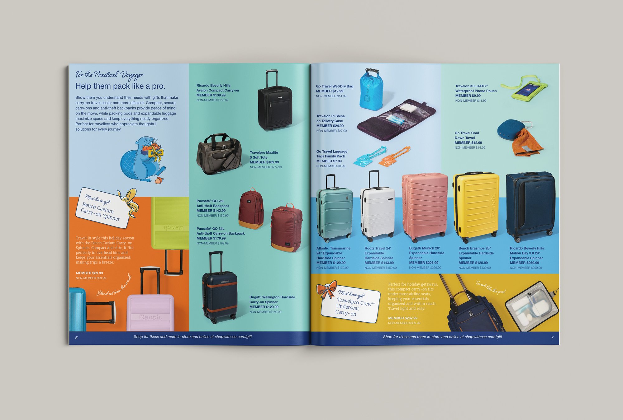
In 2024, the annual CAA Holiday Gift Guide took the form of a magazine insert, distributed to Members through CAA Magazine. The Creative Services team was asked to create an engaging gift guide that would feature over 100 products and promote rewards and offers, with two regional versions (Ontario and Manitoba) and a non-rewards option for each for testing.
Strategic Approach:
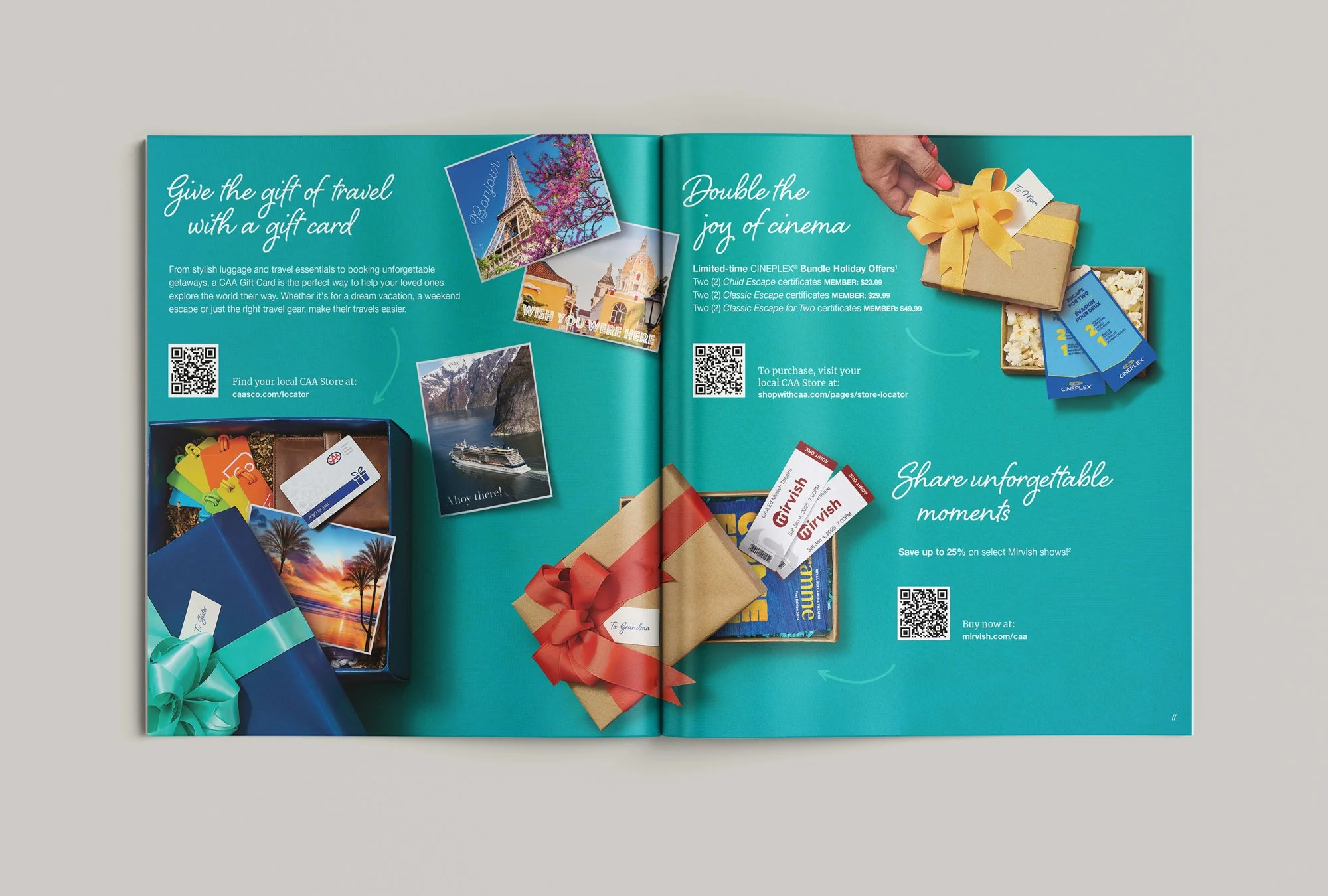
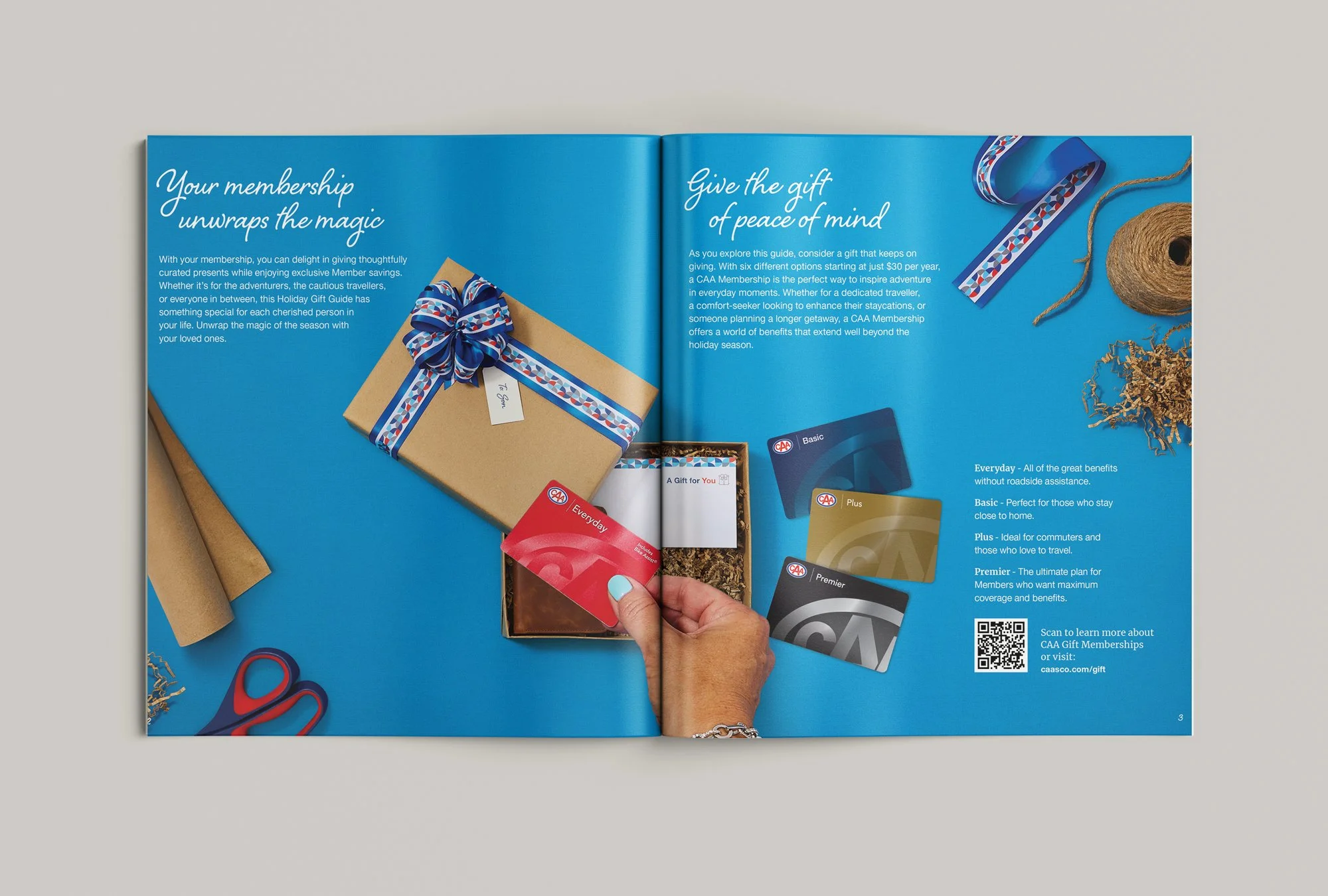
For this season, we took a storytelling approach – told through the eyes of holiday gift-giver – each spread is themed to focus on a key activity throughout the Holiday Season, including road trips, vacations, outdoor adventures and staying in.
Creative Leadership:
The vivid colours and charming winter woodland animals added magic and whimsy throughout the reading experience.
Carrying illustrated characters through the guide helped keep the tone friendly and engaging.
A strategic colour system helped the viewer understand the varied communication types throughout the guide. Cool tones for product offers, warm tones for features and rewards.
Outcome:
The campaign resonated with holiday shoppers looking for unique travel- and adventure-ready gifts, driving increased engagement and sales during a crucial shopping season.
The Holiday Gift Guide exceeded sales forecasts within weeks of publication. By transforming a traditional guide into an immersive and visually delightful experience, the CAA Holiday Gift Guide reinforced the brand’s role in making the gift-giving journey truly magical.
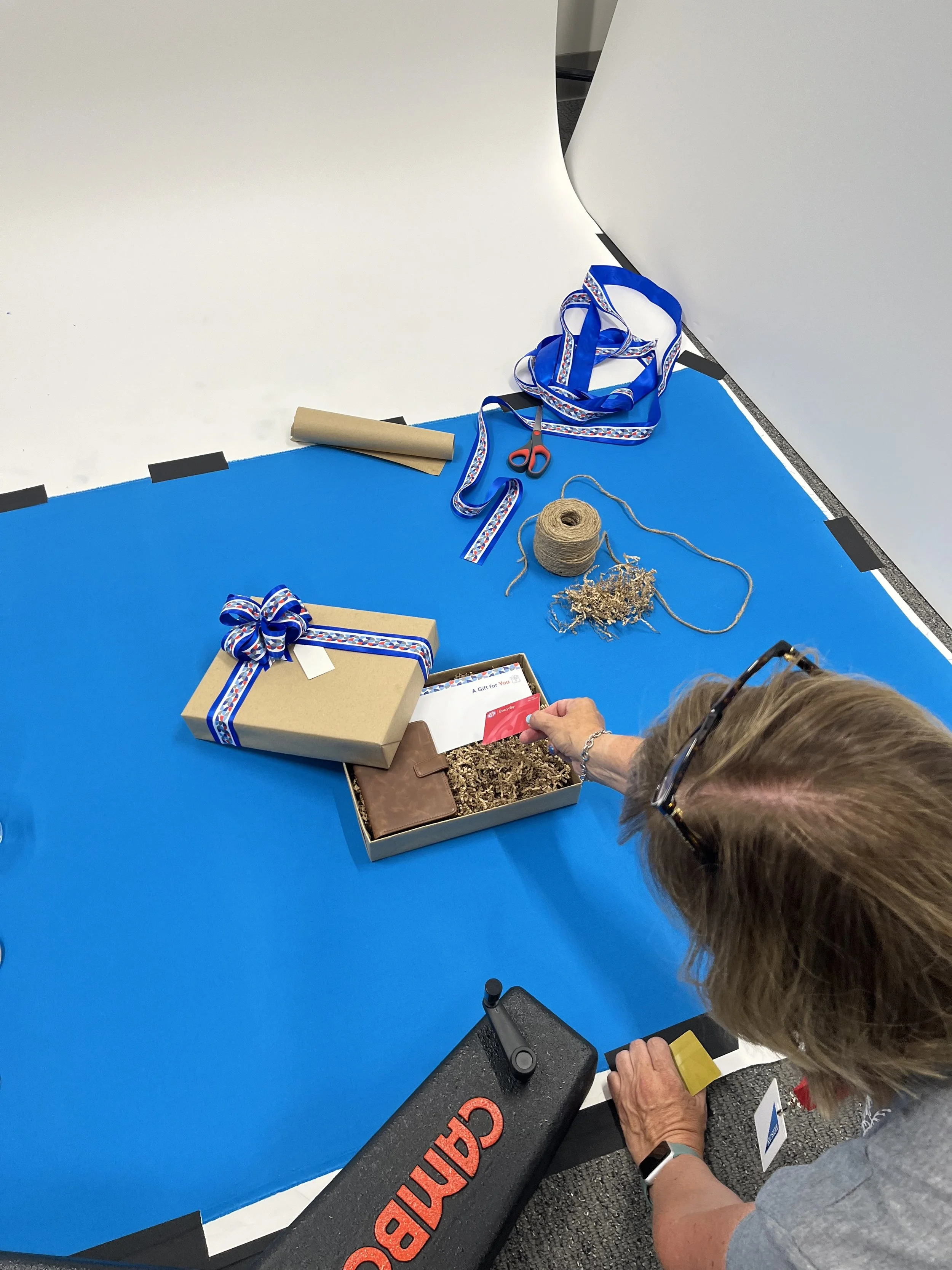
All photography shot practically, in-house by CAA’s Creative Services Team and freelance support

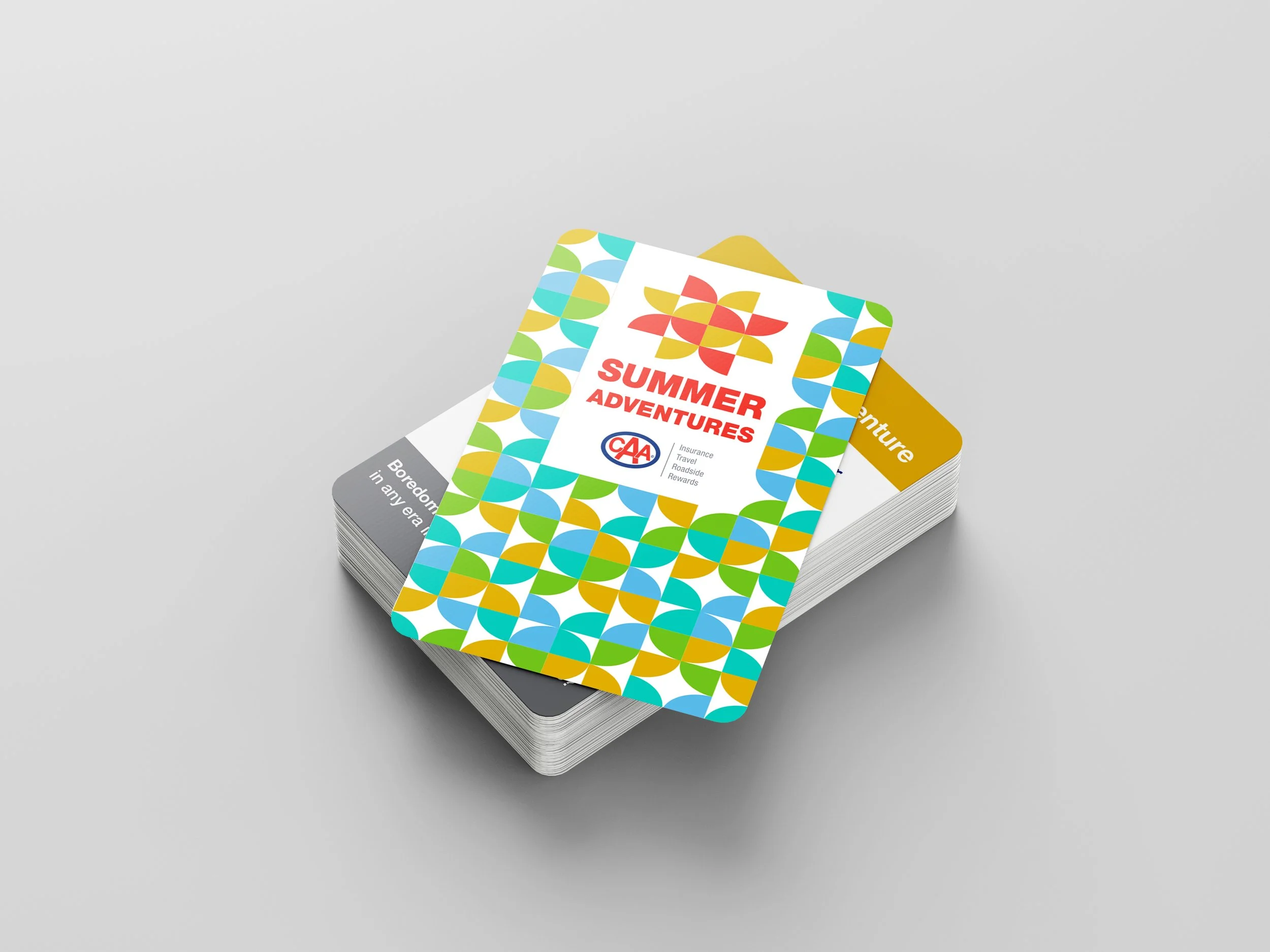
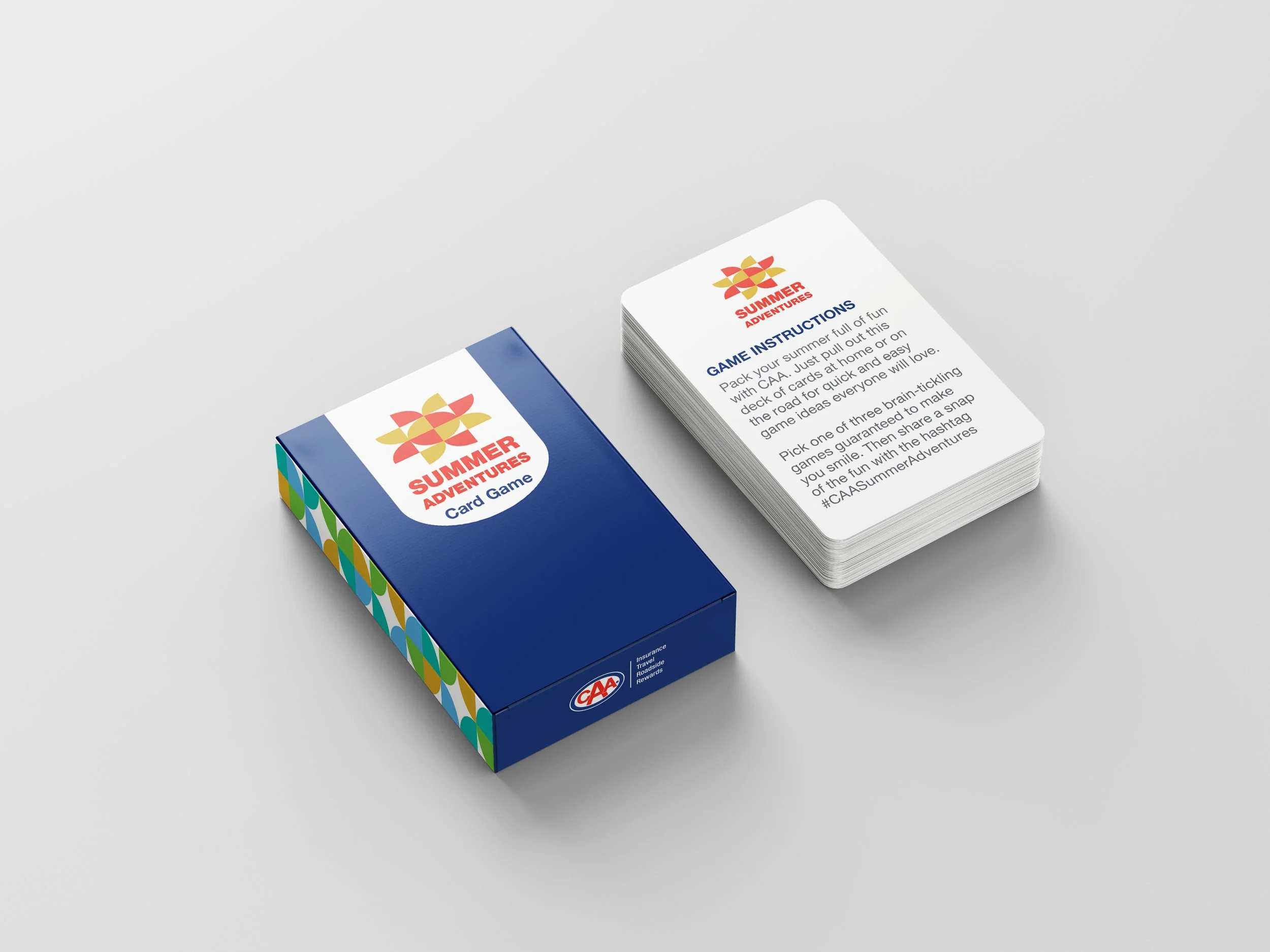
Summer Adventures Card Game 2024
CAA Club Group
Business Challenge:
CAA’s summer campaign, Summer Adventures, aimed to expose Members to the adventurous side of membership.
Underpinned by sentiments of safety and preparedness, the campaign is designed to open Members’ eyes to what CAA has to offer beyond roadside assistance, as they make the most of those short Canadian summers.
Creative Leadership:
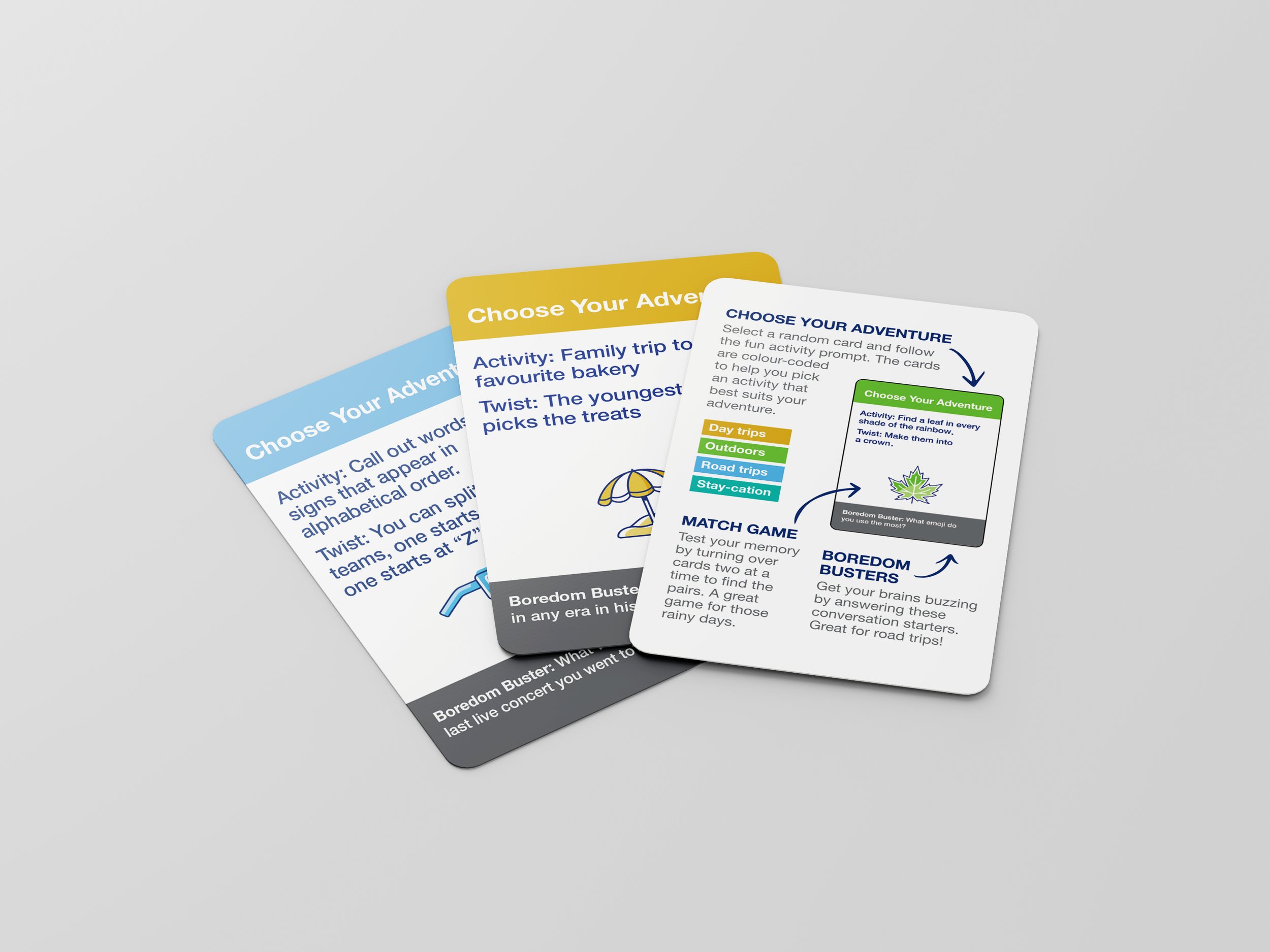
The Creative Services team developed a Summer Adventures Card Game, a portable travel card game, designed to help adventurous families build memories together – whether on the road, traveling abroad, staying in-town, or at home.
With four games built into the set, Members can play various games – allowing for multiple uses throughout the summer, and beyond.
Outcome:
The card game was a very popular giveaway throughout the summer. With many Members playing the games at the events and posting themselves using it on social media. This created useful UGC content that was reposted on CAA’s social channels throughout the summer.
Strategic Approach:
Develop an item that can be given away at CAA stores, local events and through social media promotions that will keep CAA top of mind throughout the summer.
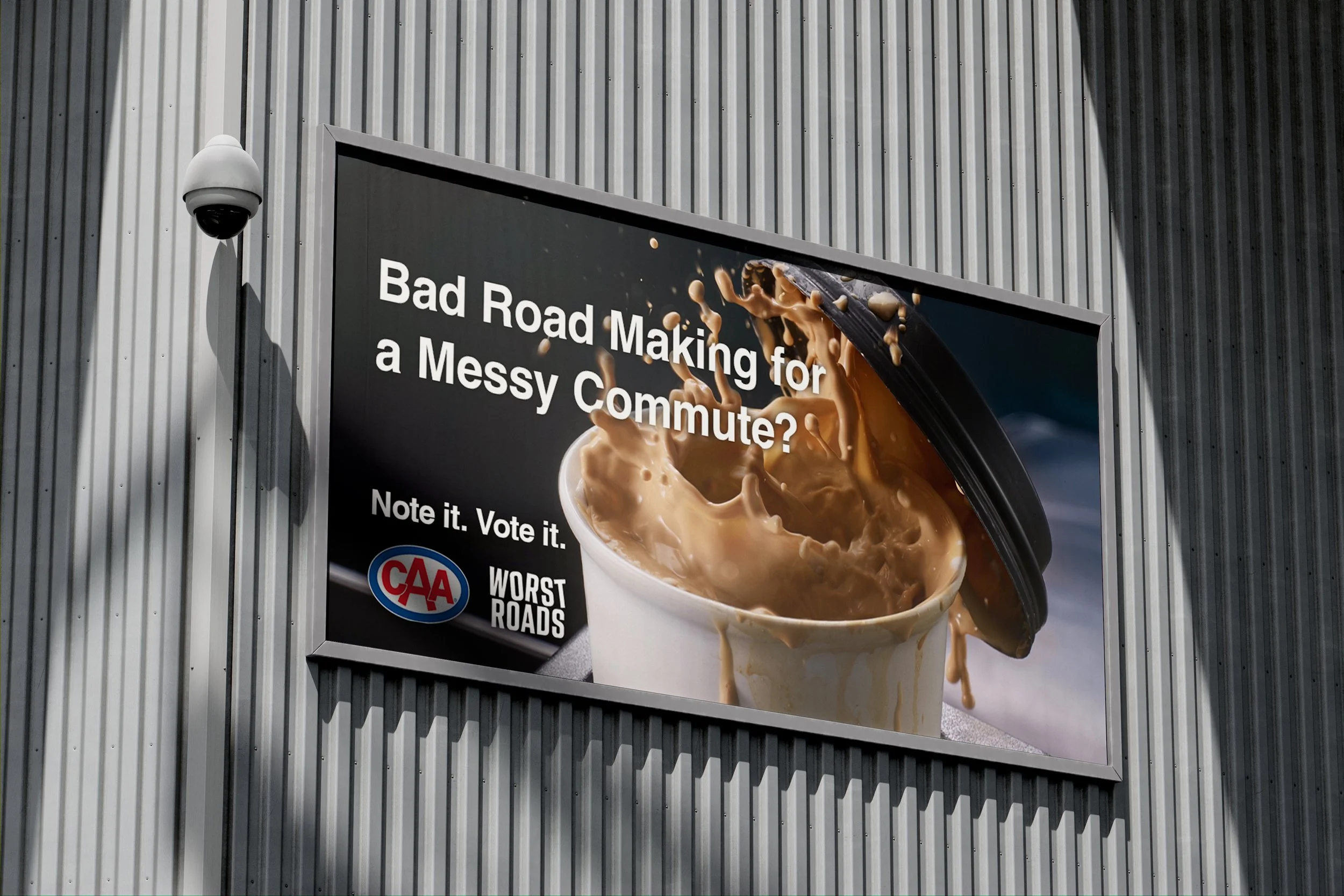
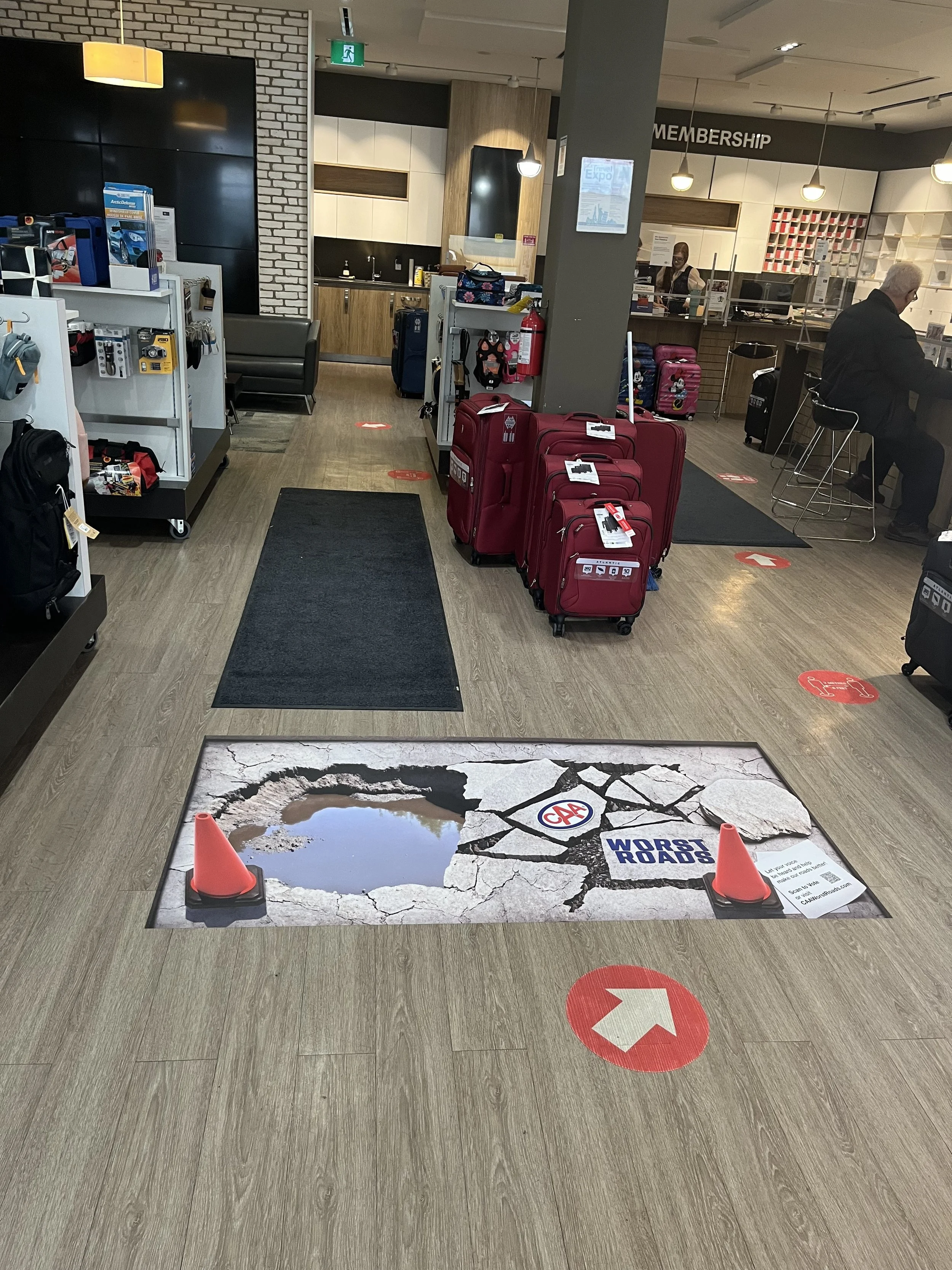
Worst Roads 2023
CAA Club Group
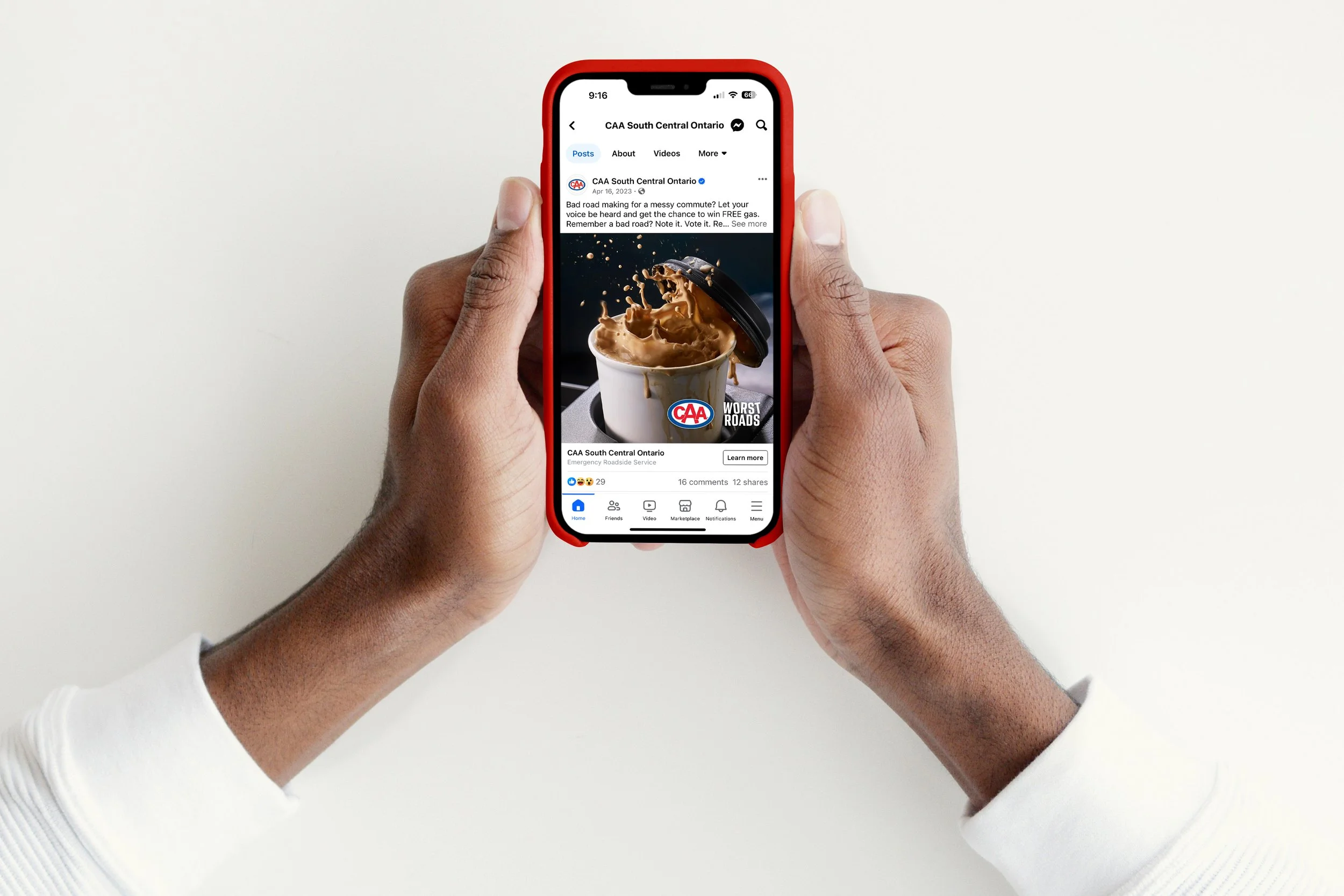
For 20 years, CAA’s Worst Roads Campaign has positively influenced change toward safer communities. This campaign is one of CAAs most popular and engaging advocacy initiatives, both from a media and public participation perspective.
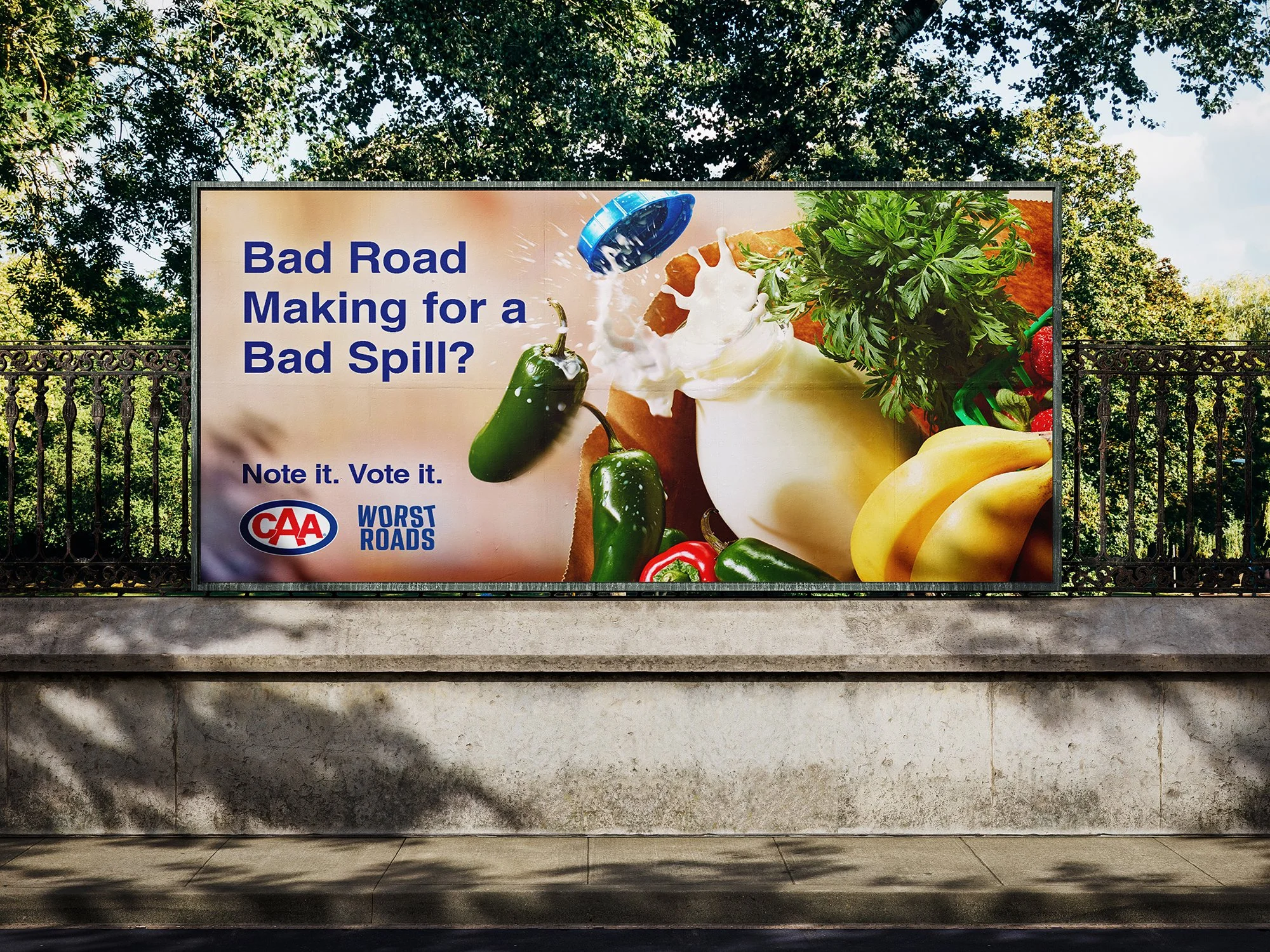
The campaign explores three main road users; pedestrians, drivers, and cyclists. Capturing the anxiety-inducing impact of a bad road. The impactful and relatable scenarios put the human experience front and centre.
The campaign was featured as a case study for effective marketing by Toronto Marketing Hub, a community of marketing and Ad Professionals in Toronto.
As a part of this campaign, an in-store activation was developed. An anamorphic 3D rendering greeted customers with a realistic representation of a bad road. Customers were invited to scan a QR code to vote for their worst road.
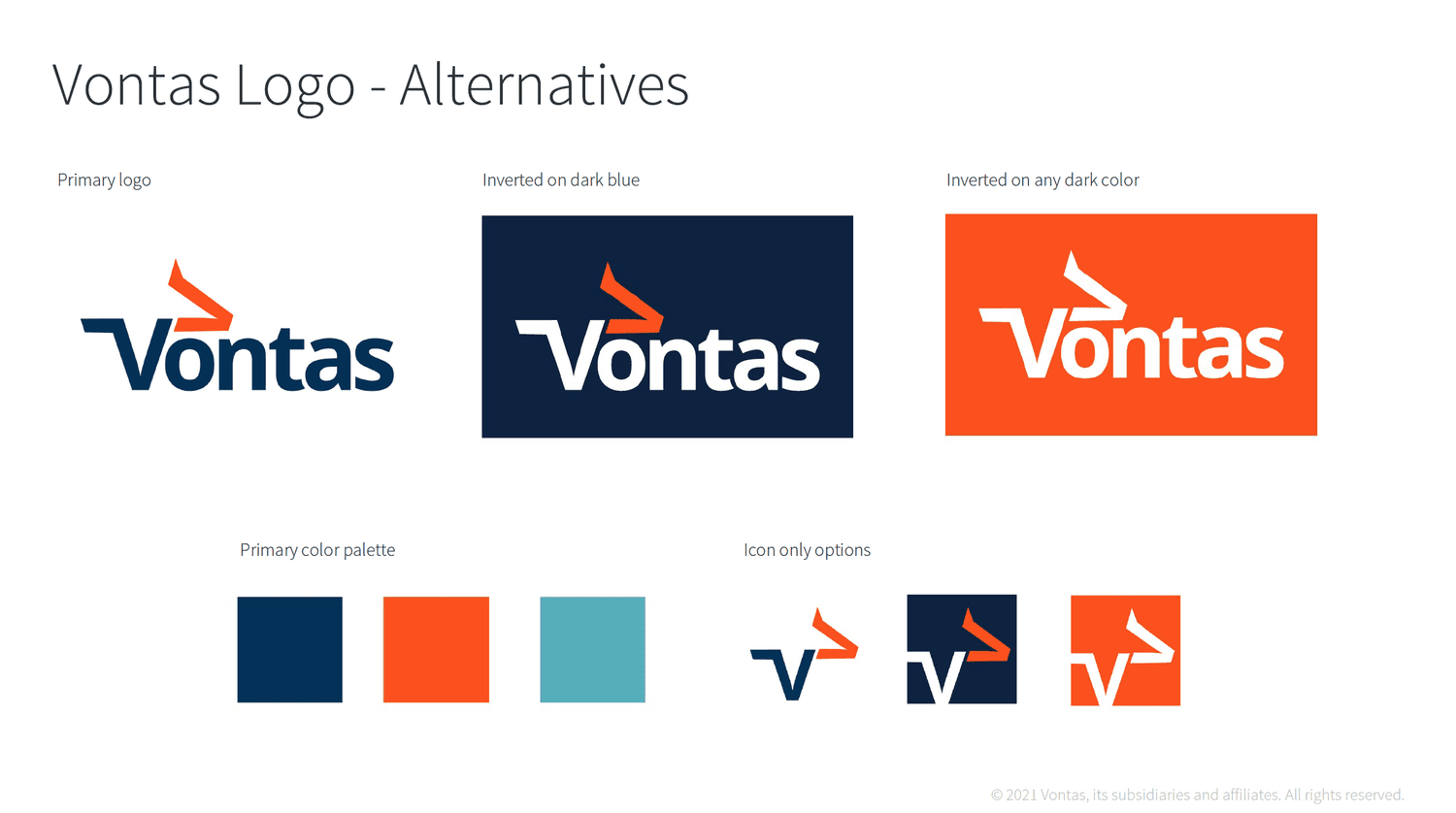
Vontas Brand Strategy & System 2021
Trapeze Group / Vontas
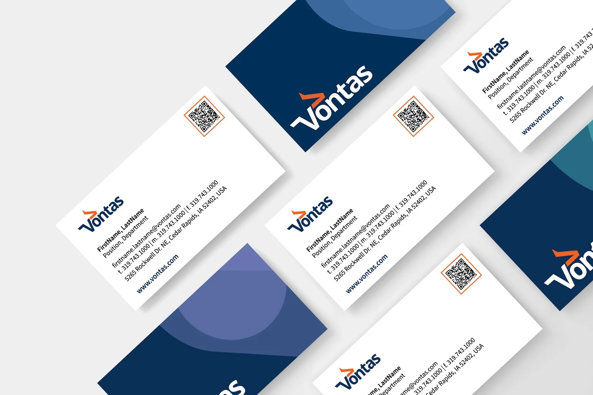
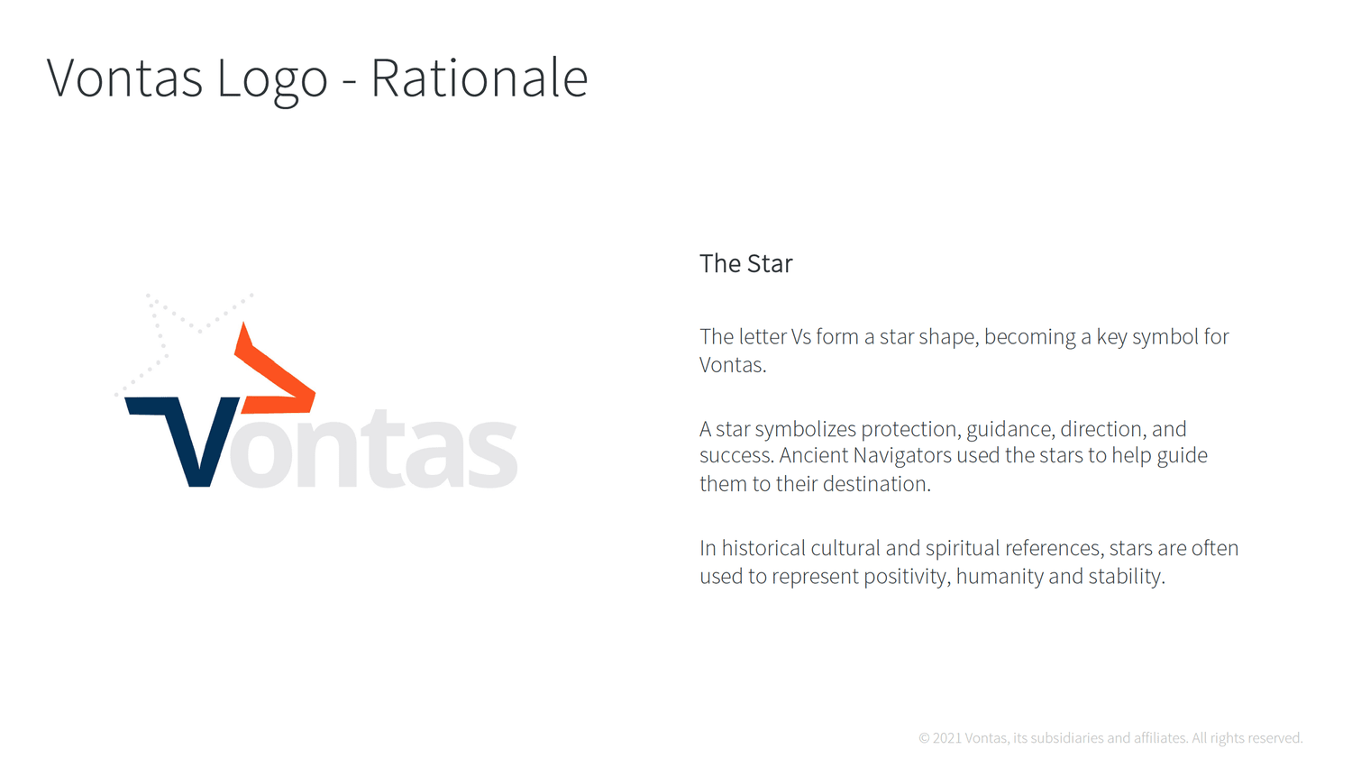
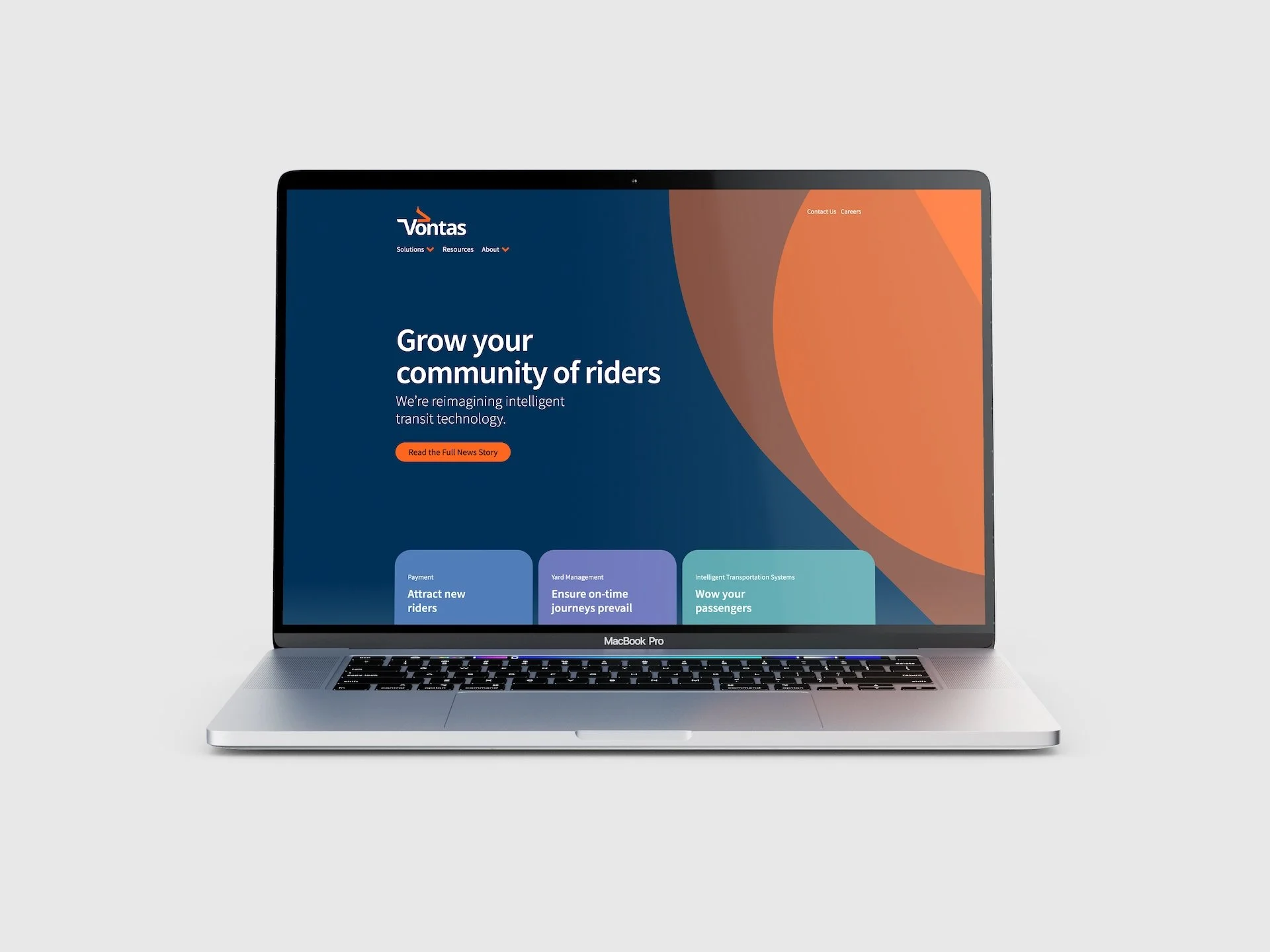
In late 2020, Trapeze Group made a decision to split their product portfolio into two businesses, creating a need for an entirely new Corporate Identity and Brand.
From focus groups, to brainstorm sessions with various executive teams, we developed an entirely new Corporate Identity – from a fresh new name to a complete corporate strategy, including a vision and mission statement.
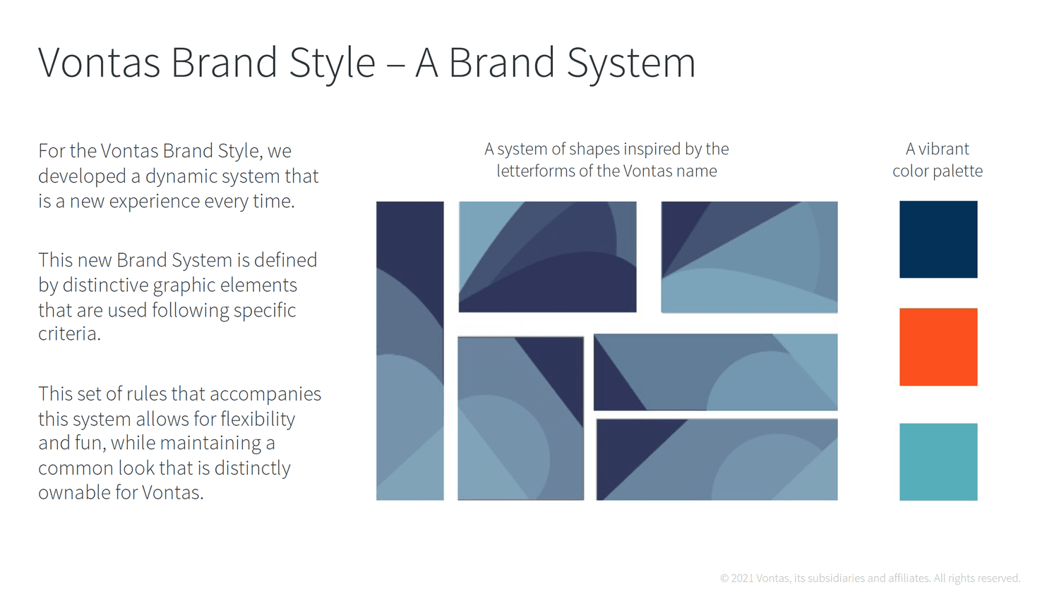
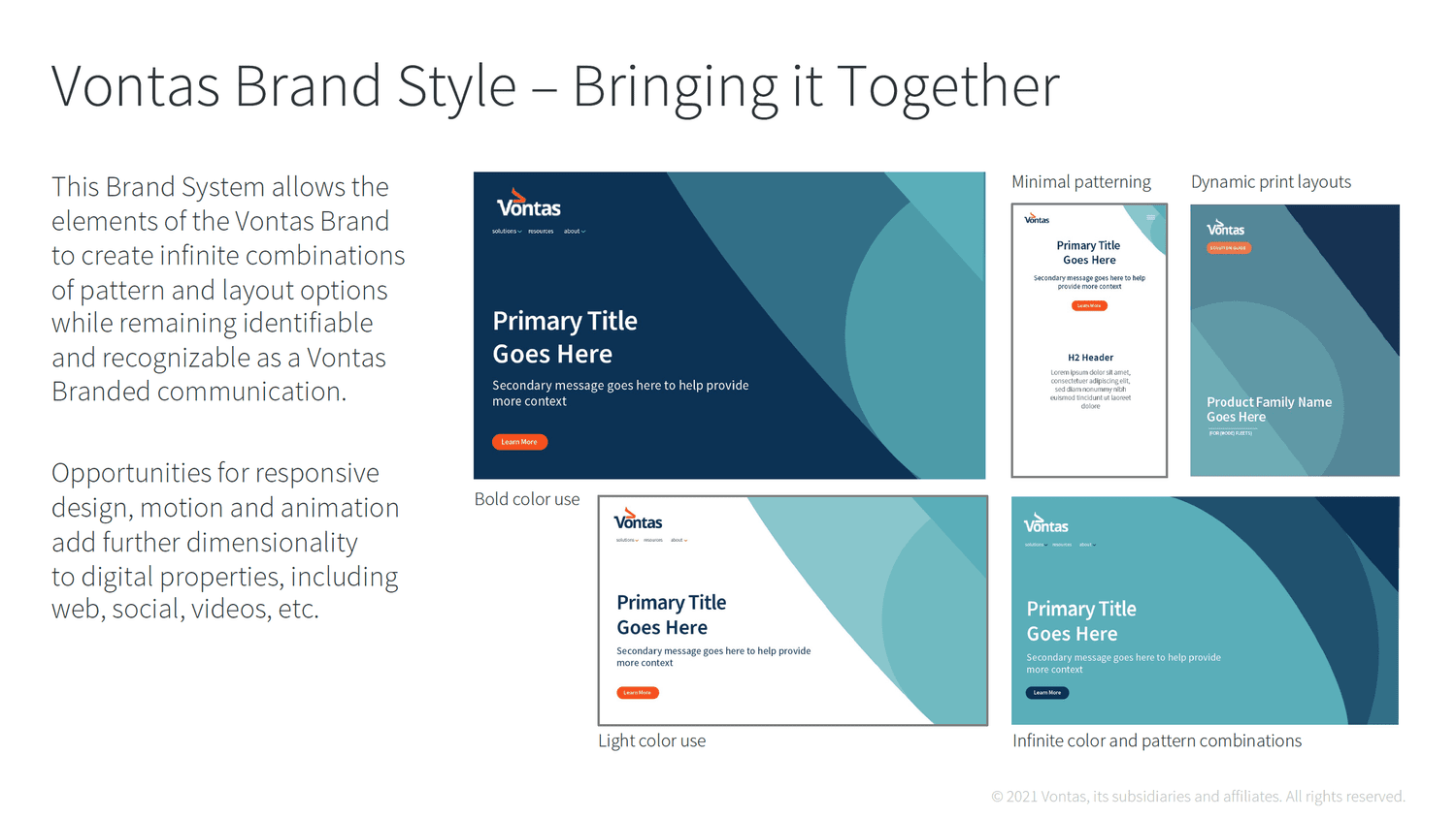
From there, we went on to create the Brand Identity, including logo exploration and a complete brand identity system.
The brand launched on-time and to great success, winning numerous awards in the process.


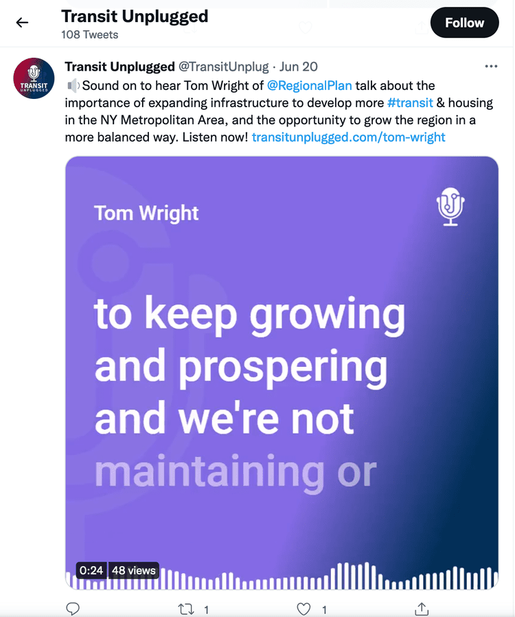
Transit Unplugged Re-Brand 2021
Trapeze Group

In 2021, the Creative & Digital team redesigned the Transit Unplugged podcast hosted by Paul Comfort of Trapeze Group.
The new brand introduced a re-imagined brand system consisting of a dedicated colour palette, visual treatment and stylized episode titles.


Using distinctive design and colour treatments, each episode category is visually distinctive allowing listeners to quickly identify their desired episode.
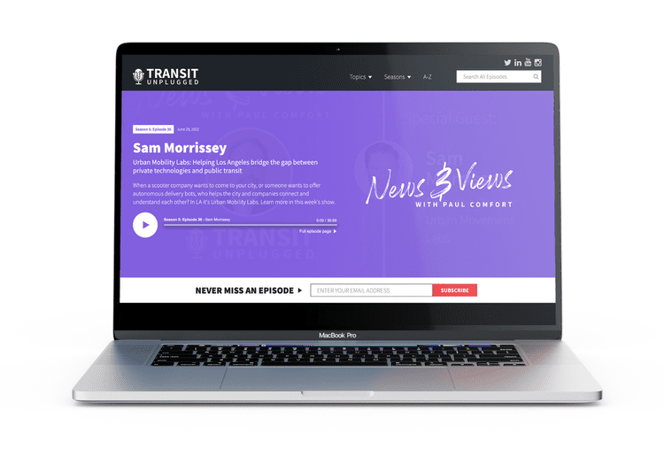
The new brand launch coincided with the launch of Transit Unplugged TV and a brand new website.